Tuesday, December 22, 2009

Self Projects

Here are some random things feel free to print them out for your friends and lovers.


 "Keep It Green"
 

"Really Always" 

Thursday, December 17, 2009

Work for Rockn' Joe

I work at a rock and roll themed coffeehouse called "Rockn' Joe".   We started some event nights to get people interested in coming into the place and seeing what we have . Here are some designs that  I've done for those event nights . I assure you there will be more of these but here are a few.


 Open Mic Night Flyer


 Guitar Hero News Paper Insert 


Vinyl Nation Art Exhibit Flyer 

     
Smoothie and Whammie Menu


Guitar Hero Night Flyer

Sunday, December 13, 2009

Tutorial Assignments from 2008

For homework we had to pick a couple of online tutorials and follow directions. There isn't a lot to say about these except the for the "Schwinn It".


"Schwinn It"

The lines made me think of the racing scene in "Tron" so i added a guy racing on his bike. I had also been saying that cheesy phrase for days hoping it would pick up, it didn't.


"Deathmites"

This one was pretty interesting to make. It was the first time I had a reason to select a row of pixels. I stretched them and then used transform perspective. After that layer masked the image and faded out the vanishing point. The crumpled paper effect is from using multiply layer effect.


"Vintage Vespa Ad" 

This tutorial showed how to create vintage effects such as grainy film lines and the bursting star effect.
The original tutorial had a Ford Mustang on it but I chose to use a Vespa. I chose the Vespa because I used to have a Silver 1979 P200e that was stolen. I miss that thing so much!

Thursday, November 26, 2009

Almost up to date.

I have a couple more things to post until the blog is current. Here are some random things I have found on my HD. Next up is more graphic design work. "Spaced Out"- 2009


"Squids" - 2009

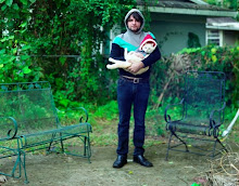
"Furries and Flurries" - 2009


I took this photo of my friend Cindy during the filming of a movie we were in 2006. I can't take credit for the make-up but it was a really great shot. She had a cigarette in her hand that I photoshoped out. The name of the movie is Automaton Transfusion written and directed by Steven C. Miller.


One of my favorite pieces. I've sold two of these and put the last one in my storage room. The project was fun to do and the show was really great.

I made this shirt shortly before the Overspray Art show at the Orlando Brewery. I used the same stencil as on the suitcases.
This is the only photo of the 7 foot paper mache sculpture I made for the Cut & Paste art show. My friend Suzy took the photo. This was during pre-beard trimmer phase of my life. The sculpture was in the shape of a girl peg in the game of "Life" and was made of a calculus math book. The title was "Two Things I Will Never Understand"

Tuesday, November 24, 2009

Student Design Work

I am currently going to college for Graphic Design. This is a posting of the stuff that I currently have done for school projects. I enjoyed working on all of these projects. I hope that you enjoy them as much as I do.

"Wake Up!"
Wake Up! was created for a Layout and Design class we had to create unity using many elements. I had a lot of fun creating this project. I wanted to create a napkin that had a coffee stain on it so that the customer would have to do a double take and wake up.

"Metro Zoo Ticket"
This was also a unity project but we were limited to only using black and white. I had fun using negative and positive space. I used the animals and African elements to bind the image together.

"Sprawl"
I created the piece of multiple images for and annual exhibit held at my college. It was displayed for several months. It was also published on the degree program website. It represents the effects of urban sprawl on homelessness and poverty. I also expresses the line that people use to withdraw themselves and the generosity towards their fellow man.

"The World( is your canvas)"
This came from a project where we had to use the same 3 elements to create emphasis. The World uses repetition to create emphasis on the shoe and then back to the other elements.


"Break it Down"
The objective of this project was to create a design using emphasis on one of three objects using placement. In this particular design the object is the Converse logo. The design starts at the bright color square and leads you through the visual hierarchy. The design is unified by the colors and break-dancing elements, such as the cardboard, dance steps and hand movements.

Paintings 2007- Present

These are all pretty low-res images until I take new photos. I got a little better with shading and spray paint. My favorites are "Whoot Done it?" and "Falling Bunnies". "Killer Robots!" was commissioned as a gift for a member of the local band "The Killer Robots!"

"Transdimensional Bunnies"-2008


"Falling Bunnies"-2008


"Blue Tooth"-2007


"Whoot Done It?" - 2007


"Killer Robots!"-2009

Photography 2005-Present

Seeing as I can't find any older digital format photographs I maybe updating this later. None of these were digitally altered. I have taken a lot of photos over the years but I am posting my favorites.


The point of this whole thing....

I'm starting this blog to have a place to organize my designs, ramblings and general interest. This is my first post/blog and I have a lot of catching up to do with postings. I'm new to this and not much of a writer/programmer, so keep that in mind if you decide to follow me on this digital journey.